


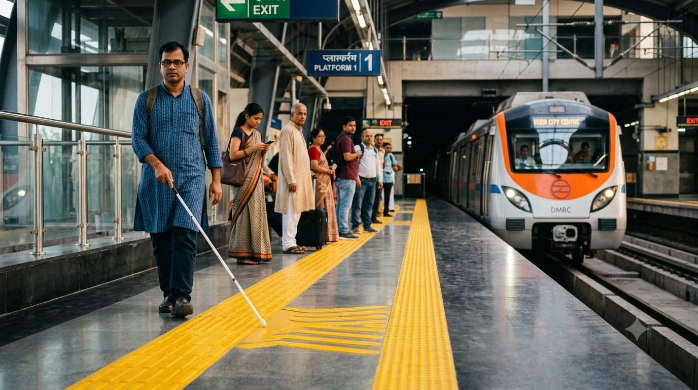
Every day, thousands of people step onto a metro platform without thinking about the floor beneath their feet. They check their phones, look for their train and move with the crowd. Along the edge of the platform, however, there is one feature that quietly serves a much bigger purpose: the bright yellow strip of tactile paving. For most commuters, it is simply part of the station. For people with visual impairments, it can provide an important clue about where they are and where they need to be careful.
A Warning You Can Feel
These raised tiles are designed to communicate information through touch. A person can detect their patterns with a cane or through their feet, making it possible to recognise changes in the surrounding space without depending entirely on sight. On a metro platform, this is especially important because the area close to the tracks is potentially dangerous. The tactile surface helps identify a boundary or warning area, giving passengers another way to understand where they should exercise caution.
The reason becomes clearer when we think about how much we normally learn through our eyes. A sighted commuter can glance at the floor and immediately see the platform edge, a staircase or a change in direction. Someone with limited or no vision cannot depend on those visual cues in the same way. Tactile paving adds another layer of information to the environment. Instead of asking a passenger to rely on sight alone, the station uses texture to communicate something that can be felt.
So, Why Is It Yellow?
The colour is chosen because it can create strong contrast with the surrounding floor, making the strip easier to identify for many people with low vision. This is important because not every visually impaired person has complete loss of sight. Some people can see shapes, colours or contrasts but may struggle to distinguish boundaries clearly. A highly visible strip can therefore provide an additional visual cue, while its raised texture provides information through touch.
That combination is what makes the design so useful. The colour can help a person with low vision notice the strip, while the raised pattern can be detected by someone using a cane. In simple terms, the same part of the platform can communicate through both sight and touch. It is a small example of a larger idea in public design: important information should be available in more than one form whenever possible.
What It Means for a Commuter
For most commuters, staying away from the platform edge is almost automatic. We see the boundary, hear the announcements and follow the movement of the crowd. For a person who cannot rely on vision, navigating the same busy space can require different kinds of information. A tactile warning surface does not remove every risk, and it does not replace careful navigation. What it does is provide a physical reference that can help a passenger understand the space around them and move with greater confidence.
This is why accessibility often works quietly in the background. A ramp, an audio announcement, a tactile path or a contrasting surface may not attract much attention from people who do not need them. Yet each feature can make a public space easier to navigate for someone else. The yellow tiles are a good example of this principle. One commuter may walk past them without noticing, while another may depend on the information they provide.
More Than Just a Yellow Strip
There is also a larger lesson here about how public spaces are designed. A metro station is built for speed and movement, but it also has to serve people with different abilities and different ways of experiencing their surroundings. Good accessibility does not mean creating a completely separate system for some passengers. It means building useful features into the environment so that more people can use the same space safely and independently.
The next time you stand on a metro platform, look down at that yellow strip. What appears to be an ordinary part of the flooring is actually part of the station’s accessibility and safety design. Its colour can make an important boundary easier to see, while its raised surface can provide information through touch. It may be easy to overlook, but that is precisely what makes it interesting. Sometimes, the most thoughtful features in the places we use every day are the ones quietly doing their job without asking us to notice them.
Subscribe Deshwale on YouTube
